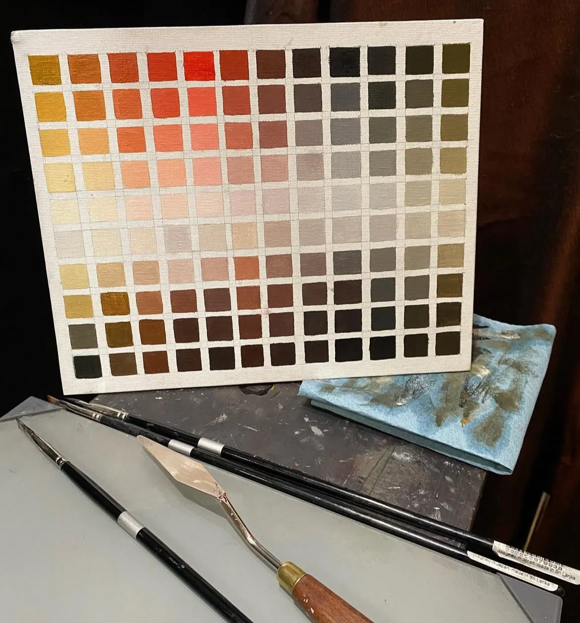
Exploring Zorn Palette Gamut. Color Mixing Exercise
You can find tons of descriptions of this (or similar) exercise and even Zorn palette color wheels. I find it useful because not only does it show you a surprisingly wide gamut of colors Zorn palette provides, but also teaches you to think about the sequence of actions when mixing a relatively wide color range + varying values and chroma.
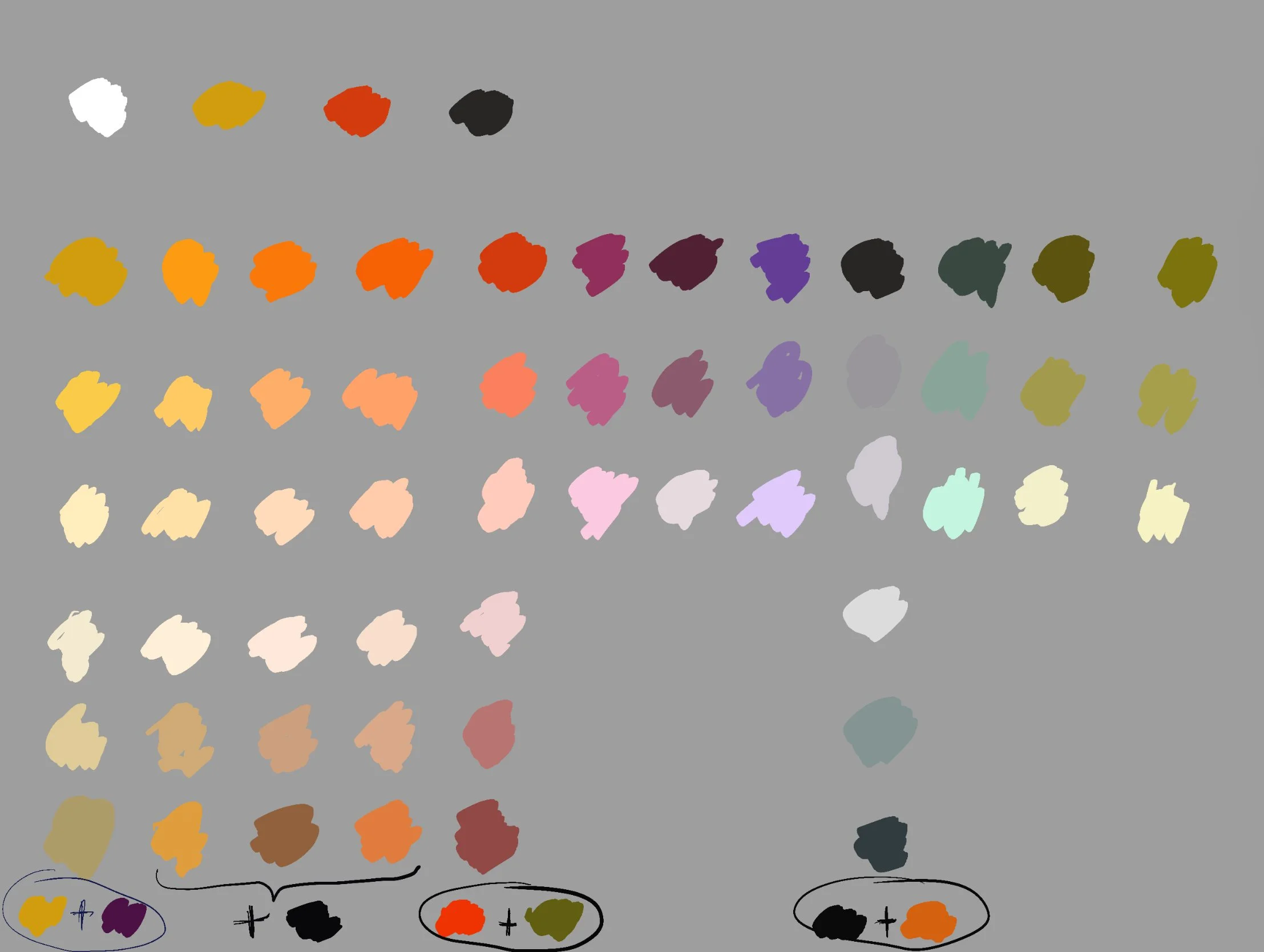
Step-by-Step Instructions. Read them first to plan how much paint to mix.
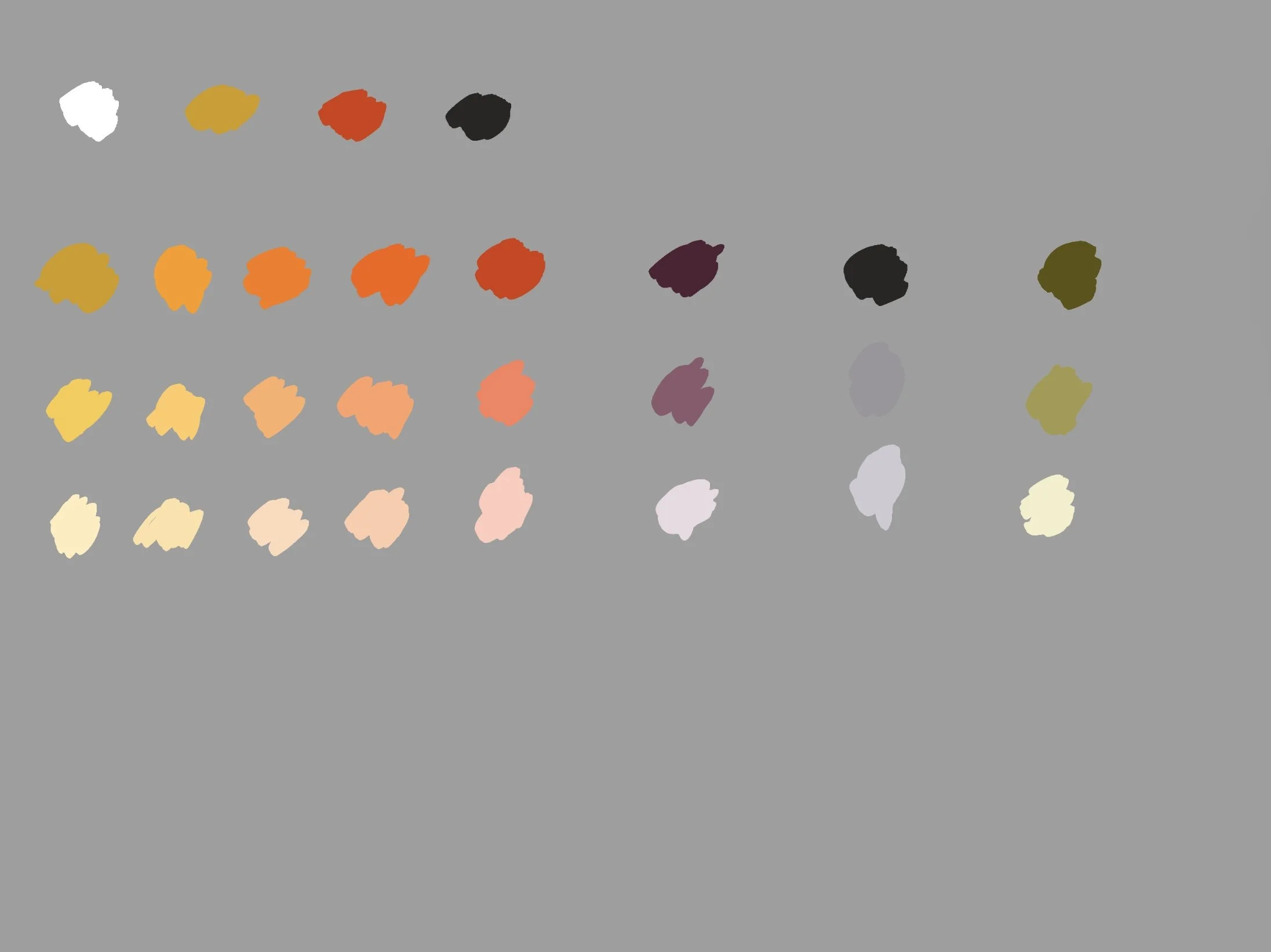
Put colors out of the tube on your palette: white, yellow ochre, cadmium red light (or whatever red you are using; the original Zorn palette contained vermilion, a vivid reddish-orange color derived from cinnabar), and ivory black (or some other black).
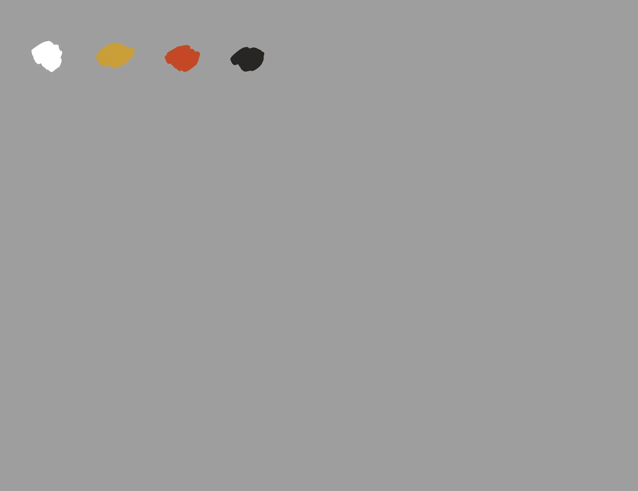
I always use the same order: white, then yellows, then reds, then blues (black = low chroma blue).
2. Use white to mix different values. Try to make the values of the mixtures across the row match. Notice the amount of white you need for these mixtures, how it changes chroma and maybe even hue (e.g. titanium white makes colors cooler and shifts them slightly towards blue).
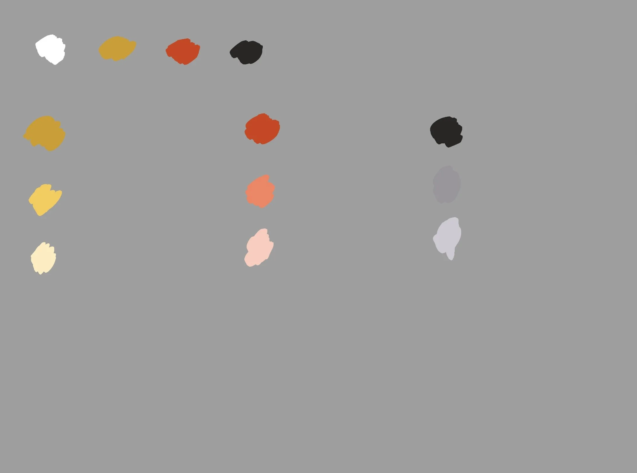
Notice different tinting strength of your paints.
This is what your primary colors look like + different values.
3. Mix YO (yellow ochre) + CR (cadmium red light) to get orange. You will probably need more YO in the mixture than CR because the latter one has a higher tinting strength. Repeat for all values.
4. CR + IB (ivory black). The resulting color will be a very low chroma violet, however, it looks more like brown. Notice the difference in tinting strength of CR and IB. Mix lighter values. Notice how they are more violet, especially if you use titanium white.
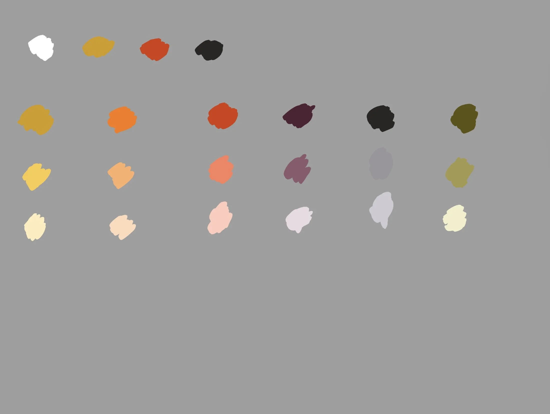
5. IB + YO. The resulting color is a warm low chroma green, kind of olive green. Mix lighter values. Now you have secondary colors + different values
6. Mix orange + YO to get yellow-orange. Mix orange + CR to get red-orange. Mix lighter values.
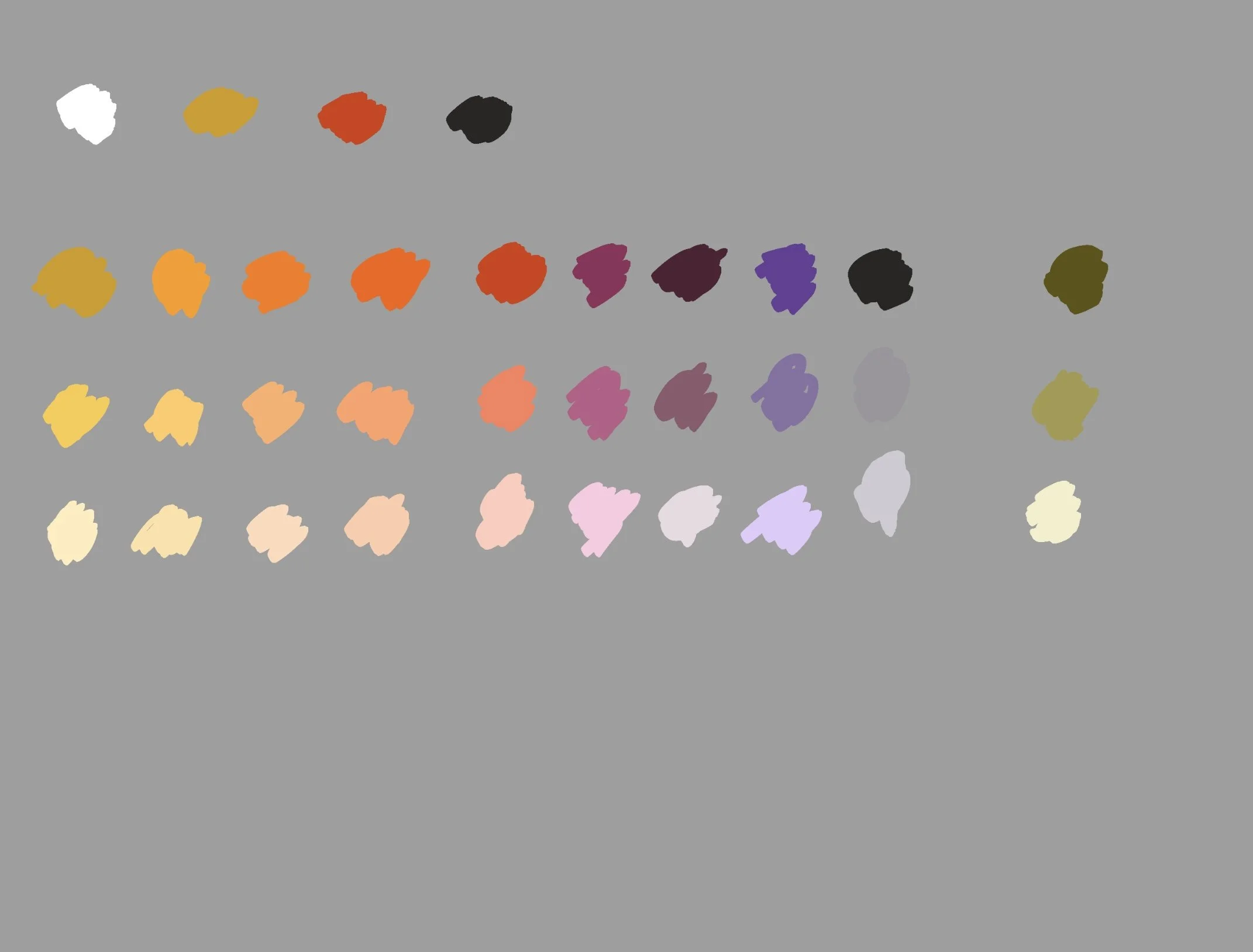
7. Mix violet + CR to get red violet. Mix violet + IB to get blue violet. Mix lighter values.
8. Mix green + YO to get yellow green, green + IB to get blue green (it’ll look like warm grey, very low chroma). Mix lighter values. Now you have tertiary colors + different values.

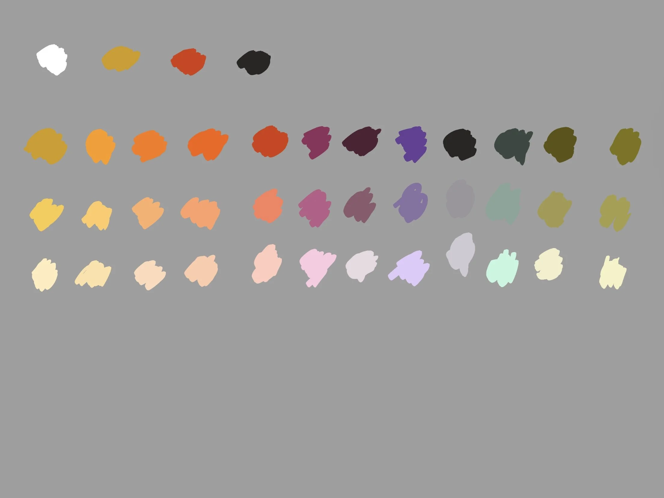
9. Now it is time to alter not only values, but chroma. You can lower chroma by adding a drop (just a drop, you do not want to change hue too much) of a complimentary color. Refer to the color wheel to find compliments:
Yellow — Violet
Orange — Blue
Red — Green
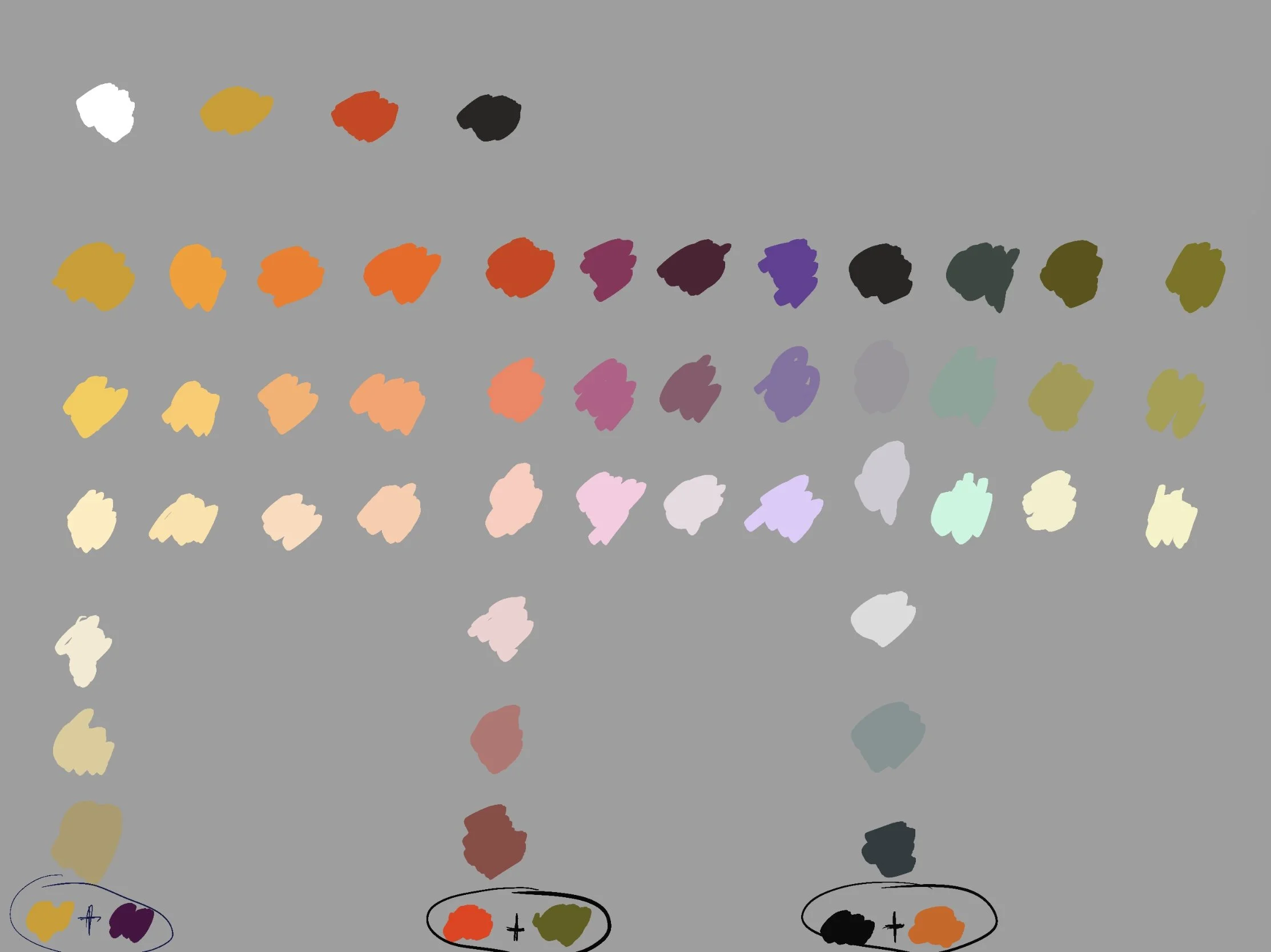
In this step, add compliments to your primaries: YO + violet, CR + green, IB + orange. Mix lighter values trying to match the values from the top part of the color chart as closely as possible.
10. You probably guessed what this step is going to be: adding compliment to oranges. Be careful: IB has a relatively high tinting strength, add just a little to not turn your orange tones into mud.
Mix lighter values. Notice that you will need more white because IB makes oranges not only more muted (lower in chroma), but also darkens them.
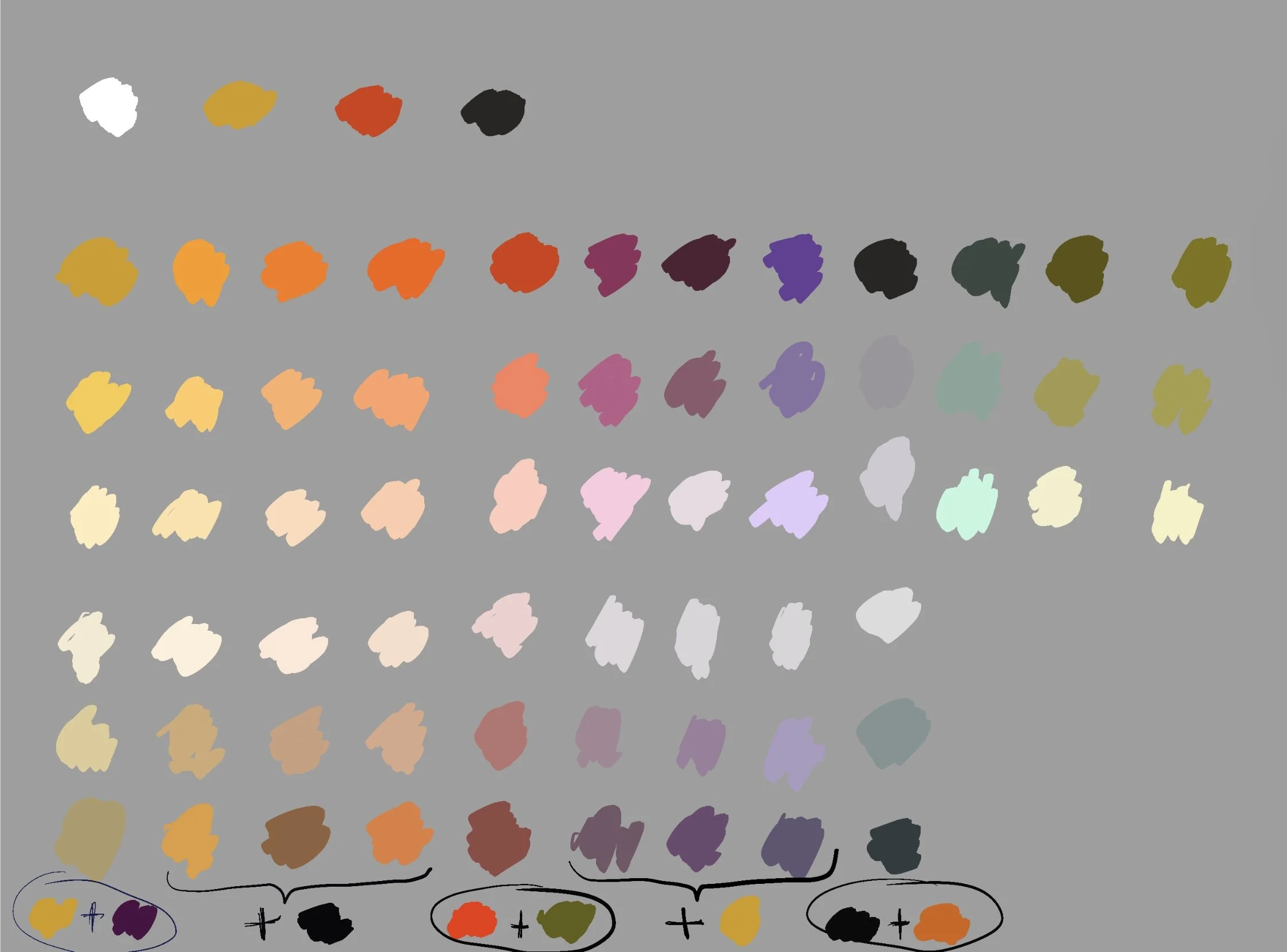
11. Mix lower chroma violets by adding a compliment, YO. Notice how chroma drops and value becomes lighter. Mix other values using white.
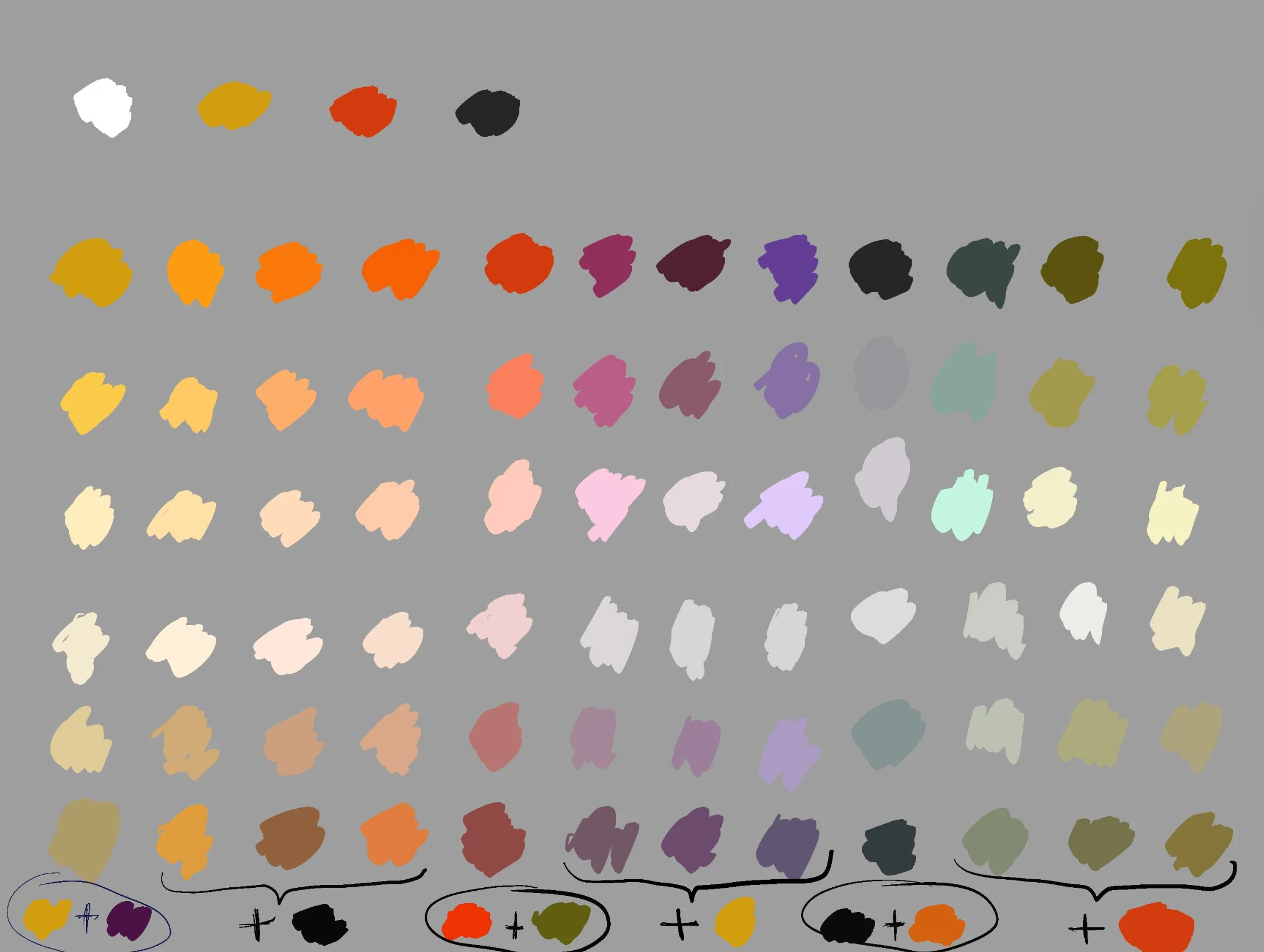
12. Final step: mix greens with a complimentary color, CR. Mix lighter values. Now you have a pretty good idea of the color gamut for Zorn palette.